Part 2 of the “Building with Sitecore Content SDK 2 and Next.js” series
In Part 1, we connected a Next.js application to SitecoreAI and reviewed how Content SDK 2 works with App Router, Experience Edge, Sitecore Pages, and component maps.
In this second part, we will build a real component called FeaturedCard, connect it to SitecoreAI, and make it fully editable in Pages.
We will then add an interactive variant to explore several key Content SDK 2 capabilities:
- Component scaffolding with Content SDK CLI
- Editable fields using Content SDK field helpers
- Server and client component maps
- Local editing host integration
- Preview of unpublished content
- Rendering variants
- React Client Components and browser-side interaction
1. Continue with the Part 1 project
We will continue using the same SitecoreAI project and site created in Part 1:
Project: ContentSDK2-GB
Environment: dev-env
Site: Content SDK 2 Demo
Site system name: content-sdk-2-demo- Open the kit-nextjs-skate-park folder in Visual Studio Code
- In Visual Studio Code, open a new terminal
- Install the project dependencies => npm ci
- Start the development server => npm run dev
- Verify that the site is running correctly at => http://localhost:3000
At this point, we are ready to start building the new component on top of the working Content SDK 2 setup from Part 1
2. Install the Content SDK CLI
Content SDK includes the sitecore-tools CLI, which provides commands for scaffolding components and generating component maps.
Open a terminal in Visual Studio Code and install the CLI globally
npm install -g @sitecore-content-sdk/cli@2.2.0For project-specific commands, we will use the CLI version installed locally with the starter to keep it aligned with the project dependencies.
3. Scaffold the FeatureCard component
Content SDK CLI can generate the initial structure of a new component for us.
In the Visual Studio Code terminal, run:
.\node_modules\.bin\sitecore-tools.cmd project component scaffold FeatureCardThe CLI creates => src/components/FeatureCard.tsx
The generated component includes a Default export, which will be the initial rendering variant for FeatureCard.
We will now replace the placeholder implementation with editable Sitecore fields.
4. Add editable fields to FeatureCard
Open src/components/FeatureCard.tsx in Visual Studio Code and replace the generated placeholder with the following implementation:
import React from 'react';
import {
  ComponentParams,
  ComponentRendering,
  Field,
  ImageField,
  LinkField,
  Text,
  RichText,
  NextImage,
  Link,
} from '@sitecore-content-sdk/nextjs';

interface FeatureCardFields {
  Title: Field;
  Description: Field;
  Image: ImageField;
  Link: LinkField;
}

interface FeatureCardProps {
  rendering: ComponentRendering & { params: ComponentParams };
  params: ComponentParams;
  fields: FeatureCardFields;
}

export const Default = (props: FeatureCardProps): React.JSX.Element => {
  const id = props.params.RenderingIdentifier;

  return (
    < div className={`component ${props.params.styles}`} id={id || undefined}>
      < div className="component-content">
        < NextImage field={props.fields.Image} />
        < Text tag="h2" field={props.fields.Title} />
        < RichText field={props.fields.Description} />
        < Link field={props.fields.Link} />
      < /div>
    < /div>
  );
};
The component now expects four Sitecore fields => Title, Description, Image, and Link.
Instead of rendering plain React values, we use Content SDK field helpers such as Text, RichText, NextImage, and Link. These helpers preserve the metadata required for visual editing in Sitecore Pages.
Before moving on, validate the component:
npm run type-checkThe command should complete without errors.
5. Create the rendering in SitecoreAI
Now that the React component exists, SitecoreAI needs a rendering definition that points to FeatureCard.
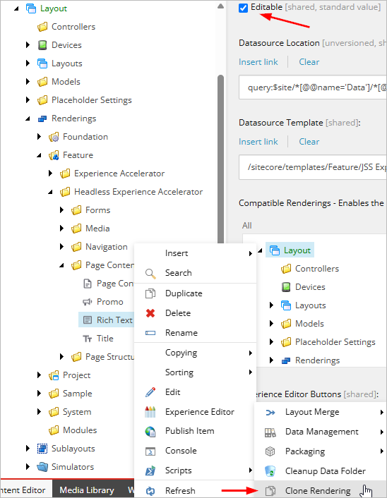
Open Content Editor and navigate to /sitecore/layout/Renderings/Feature/Headless Experience Accelerator/Page Content/Rich Text.
Right-click Rich Text and select Scripts → Clone Rendering.
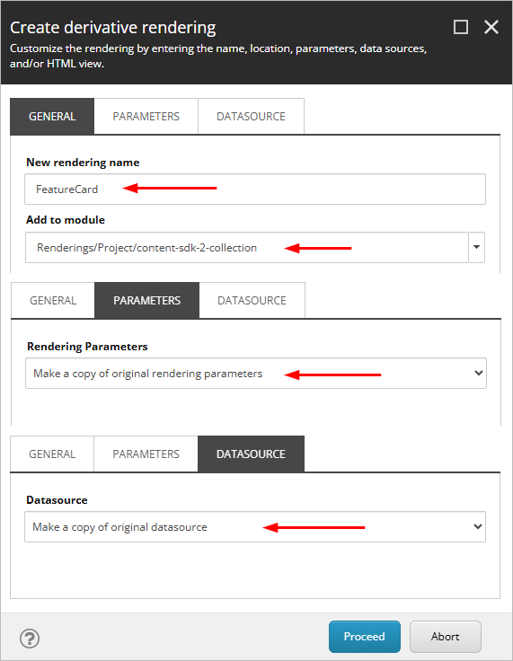
In the Create derivative rendering dialog, configure the following:
- New rendering name => FeatureCard
- Add to module => content-sdk-2-collection
- Parameters => Make a copy of original rendering parameters
- Datasource => Make a copy of original datasource
Complete the wizard.
The new rendering is created under the project module, typically at /sitecore/layout/Renderings/Project/content-sdk-2-collection/FeatureCard.
Select FeatureCard and verify:
- Component Name => FeatureCard
- Editable => checked
The Component Name must match the component key that Content SDK will later register in the generated component map.
6. Configure the FeatureCard datasource template
Cloning the Rich Text rendering also creates a copy of its datasource template under the project module.
In Content Editor, navigate to /sitecore/templates/Project/content-sdk-2-collection/Text and open the Builder tab.
The cloned template initially contains a single Text section with one Rich Text field.
Update it as follows:
- Rename the section Text => Content
- Rename the existing field Text => Description
- Keep Description as Rich Text, Keep Source => query:$xaRichTextProfile
Then add these fields to the Content section:
- Title => Single-Line Text
- Image => Image
- Link => General Link
The final datasource structure is:
Content => Title, Description, Image, Link
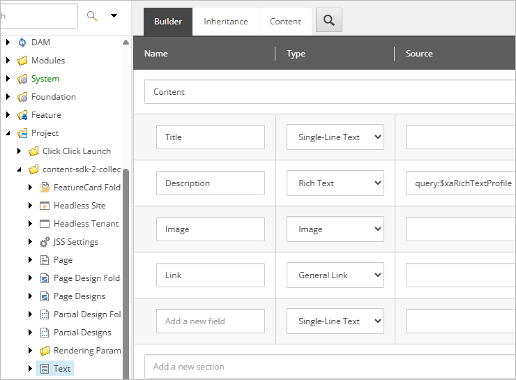
This datasource now matches the fields expected by FeatureCard.tsx.
7. Generate the component maps
Content SDK uses generated component maps to connect Sitecore rendering names with their React implementations.
In the Visual Studio Code terminal, run:
.\node_modules\.bin\sitecore-tools.cmd project component generate-mapContent SDK generates two files
- .sitecore/component-map.ts
- .sitecore/component-map.client.ts.
Because the component does not use ‘use client’, React hooks, or browser APIs yet, it should not appear in component-map.client.ts.
This demonstrates an important Content SDK 2 behavior: server-side components are registered in the main component map without being included in the client component map.
8. Make FeatureCard available in Sitecore Pages
The rendering now exists in SitecoreAI and is registered in the component map, but authors still need access to it from the Pages component toolbox.
In Content Editor, navigate to /sitecore/content/Content SDK 2 Collection/Content SDK 2 Demo/Presentation/Available Renderings.
Right-click Available Renderings and select Insert → Available Renderings.
Name the new item => Custom Components
Select Custom Components, then in the Renderings field click Edit.
Navigate to /sitecore/layout/Renderings/Project/content-sdk-2-collection/FeatureCard and add FeatureCard to the selected renderings.
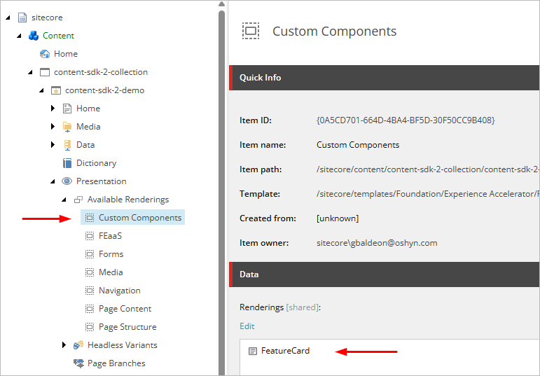
Save the item.
Next, select the parent Available Renderings item and make sure the following option is enabled:
Group renderings in sections according to Available Renderings items in the site
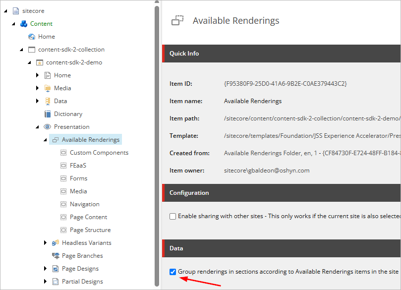
This setting tells Sitecore Pages to organize the component toolbox using the categories defined under Available Renderings.
With this option enabled, FeatureCard should appear under:
Components => Custom Components => FeatureCard
Using a dedicated category keeps custom project components separate from standard Sitecore categories such as FEaaS and Forms.
Note: If the target placeholder has Allowed Controls configured, you must also add FeatureCard to that list. If Allowed Controls is empty, no additional placeholder configuration is required.
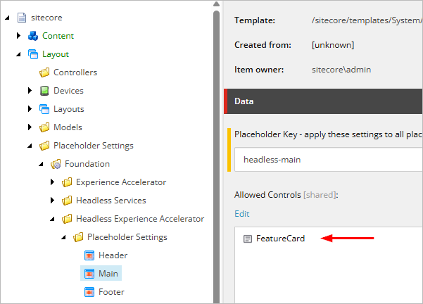
Using a dedicated custom category keeps project components separate from standard Sitecore categories such as FEaaS and Forms.
9. Connect Sitecore Pages to your local frontend
At this point, SitecoreAI knows about the FeatureCard rendering, but the deployed editing host does not yet contain the new React component.
Make sure the local frontend is running:
npm run devVerify that the application is available at:
Then open Sitecore Pages and select Content SDK 2 Demo.
Open the Editing host selector and choose Local host.
Set the local host URL to:
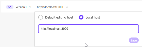
Save the configuration.
Pages will now use your local Next.js application while editing the site.
The flow is:
Sitecore Pages => Local host => localhost:3000 => component-map.ts => FeatureCard
This allows you to build and test new components in Pages before deploying a new frontend build.
10. Add FeatureCard to the page
In Sitecore Pages, open the Home page.
In the components panel, navigate to:
Components => Custom Components => FeatureCard
Drag FeatureCard into the main content area of the page.
When Sitecore asks for a datasource, create a new one and populate the fields:
- Title => Explore Content SDK 2
- Description => Build editable components with SitecoreAI and Next.js.
- Image => Select an image from the Media Library
- Link => Configure a link with the text Learn more
Save the datasource and then save the page.
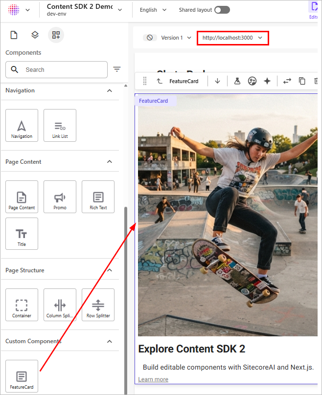
At this point, FeatureCard is fully managed by Sitecore and rendered by your local Next.js application.
11. Validate editing and Preview mode
Now verify that the component participates correctly in the Sitecore authoring workflow.
In Sitecore Pages, select the FeatureCard and change the Title field.
Use: Explore Content SDK 2
Click Save, but do not publish the page.
Then open your local site at http://localhost:3000 and refresh the page.
Because the application is using the Preview context configured in Part 1, the saved but unpublished content should appear immediately in the local frontend.
This confirms the full authoring flow:
Sitecore Pages => Edit content => Save => Preview => Local Next.js application
12. Prepare the interactive variant
Now that the default version of FeatureCard is working, we will add a second variant with client-side interaction.
The goal is to support two variants:
FeatureCard => Default, Interactive
Because both variants will be grouped under the same component entry, we will keep them in the same client-side runtime.
Open src/components/FeatureCard.tsx and add this line at the very top:
'use client';The Default variant will continue rendering the same content, but it will now be included in the client component map together with the interactive variant we create next.
13. Create the interactive variant
Inside src/components, create a new file named FeatureCard.interactive.tsx.
Add the following implementation:
'use client';
import React, { useState } from 'react';
import {
ComponentParams,
ComponentRendering,
Field,
ImageField,
LinkField,
Text,
RichText,
NextImage,
Link,
} from '@sitecore-content-sdk/nextjs';
interface FeatureCardFields {
Title: Field;
Description: Field;
Image: ImageField;
Link: LinkField;
}
interface FeatureCardProps {
rendering: ComponentRendering & { params: ComponentParams };
params: ComponentParams;
fields: FeatureCardFields;
}
export const Interactive = (props: FeatureCardProps): React.JSX.Element => {
const [expanded, setExpanded] = useState(false);
const id = props.params.RenderingIdentifier;
return (
< div className={`component ${props.params.styles}`} id={id || undefined}>
< div className="component-content">
< NextImage field={props.fields.Image} />
< Text tag="h2" field={props.fields.Title} />
{expanded && This variant uses useState and an onClick handler, so it must run as a Client Component.
The new file is created at => src/components/FeatureCard.interactive.tsx
The component family now has two variants => Default and Interactive
Before continuing, validate the code:
npm run type-checkThe command should complete without errors.
14. Regenerate the component maps
Now regenerate the Content SDK component maps so the new variant is discovered:
.\node_modules\.bin\sitecore-tools.cmd project component generate-mapContent SDK now detects both files => src/components/FeatureCard.tsx and src/components/FeatureCard.interactive.tsx
In .sitecore/component-map.ts, you should see both implementations grouped under the same component key => FeatureCard
In .sitecore/component-map.client.ts, you should also see FeatureCard with both the Default and Interactive variants, because both now use ‘use client’.
Conceptually, Content SDK now resolves:
FeatureCard => Default, Interactive
This demonstrates how Content SDK 2 groups multiple React variants under a single Sitecore component without requiring manual edits to the generated component maps.
15. Register the variants in SitecoreAI
Now Sitecore needs to know which variants are available for FeatureCard.
In Content Editor, navigate to /sitecore/content/Content SDK 2 Collection/Content SDK 2 Demo/Presentation/Headless Variants.
Right-click Headless Variants and select Insert → Variants.
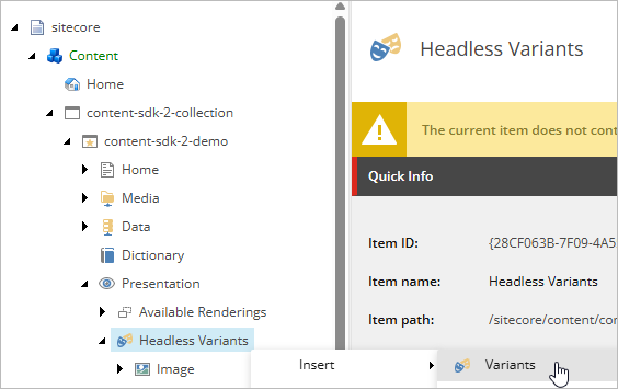
Name the new item => FeatureCard
Then right-click FeatureCard and select Insert → Variant Definition.
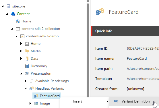
Create the first variant => Default
Repeat the process and create the second variant => Interactive
The final structure should be:
Headless Variants => FeatureCard => Default, Interactive
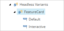
For Interactive, you can leave Allowed in templates empty so the variant is not restricted to a specific page template.
Save the changes.
16. Select the Interactive variant in Sitecore Pages
Return to Sitecore Pages and make sure the editing host is still set to Local host with http://localhost:3000.
Select the FeatureCard already added to the page.
Open the Design panel and locate the variant selector.
You should now see two options => Default and Interactive
Select Interactive.
The component should now display a Show details button.
Click Show details. The Description field should become visible and the button text should change to Hide details.
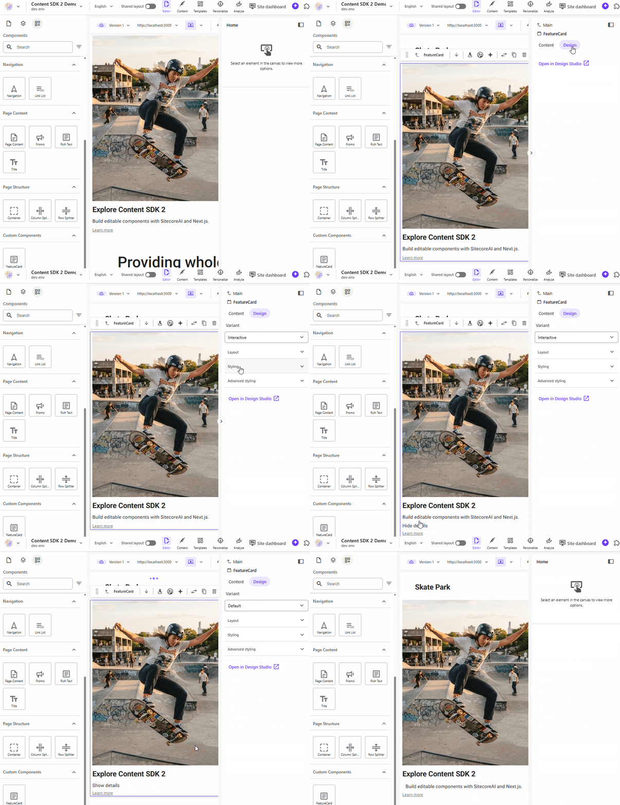
This confirms the complete variant flow:
Sitecore Pages => Interactive variant => FeatureCard => Client Component => useState
17. Validate the production build
Before finishing the tutorial, validate the project with the standard quality checks:
npm run type-check
npm run lint
npm run build
The production build should complete successfully.
Once the build is generated, start the application in production mode:
npm run next:startOpen http://localhost:3000 and verify that:
- FeatureCard renders correctly.
- The Default variant works.
- The Interactive variant works.
- Show details and Hide details behave as expected.
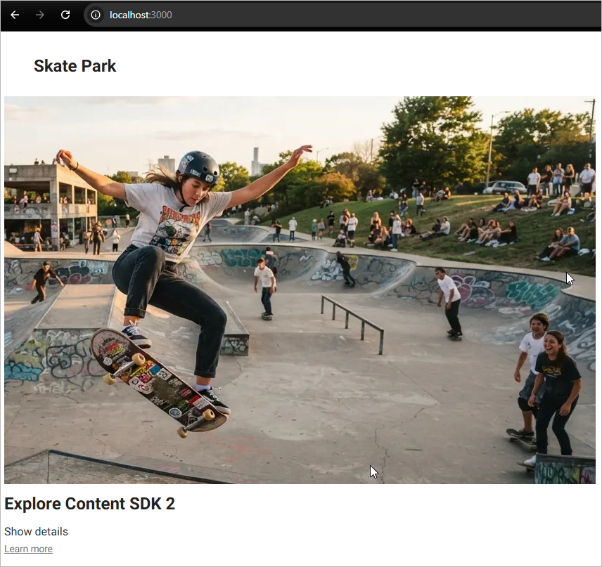
It is important to run npm run build before npm run next:start after making component changes, because next:start serves the existing production build and does not compile the application again.
18. Conclusion
We started with a scaffolded React component and turned it into a fully integrated SitecoreAI component.
Along the way, we used several key Content SDK 2 capabilities:
| Feature | How we used it |
|---|---|
| CLI scaffolding | Generated the initial FeatureCard.tsx |
| Field helpers | Rendered Text, RichText, NextImage, and Link fields |
| Component maps | Automatically registered the React component |
| Server Components | Used for the initial non-interactive version |
| Client Components | Added browser-side interaction |
| Local editing host | Tested the component in Pages before deployment |
| Preview | Displayed saved but unpublished content locally |
| Rendering variants | Added Default and Interactive variants |
| App Router | Integrated the component with the Next.js runtime |
In this tutorial, we moved beyond simply connecting a Next.js application to SitecoreAI and built a component that participates fully in the Sitecore authoring experience.
We started with Content SDK CLI scaffolding and progressively connected FeatureCard to:
- A Sitecore rendering definition
- A structured datasource template
- Sitecore Pages
- Preview mode
- Generated component maps
- Server and Client Component behavior
- Rendering variants
The final result demonstrates an important Content SDK 2 concept: Sitecore manages the content, composition, datasource, and selected variant, while Next.js controls how the component is implemented and executed.
Our FeatureCard is now editable by content authors, testable locally before deployment, and capable of supporting multiple frontend behaviors through variants.
What to expect in Part 3
In Part 3, we will move from component development to the more advanced runtime capabilities available in Content SDK 2.
The next article will focus on features such as:
- Personalization — render different experiences based on Sitecore personalization rules.
- Events and tracking — capture user interactions from the frontend.
- Analytics integration — understand how Content SDK initializes browser-side tracking.
- Caching — explore the caching capabilities available with the current Content SDK architecture.
- Revalidation — keep statically rendered content up to date when Sitecore content changes.
- Production considerations — understand how these capabilities behave outside Preview and local development.
The goal of Part 3 will be to take the application from an editable Sitecore frontend to a more complete personalized and measurable digital experience.